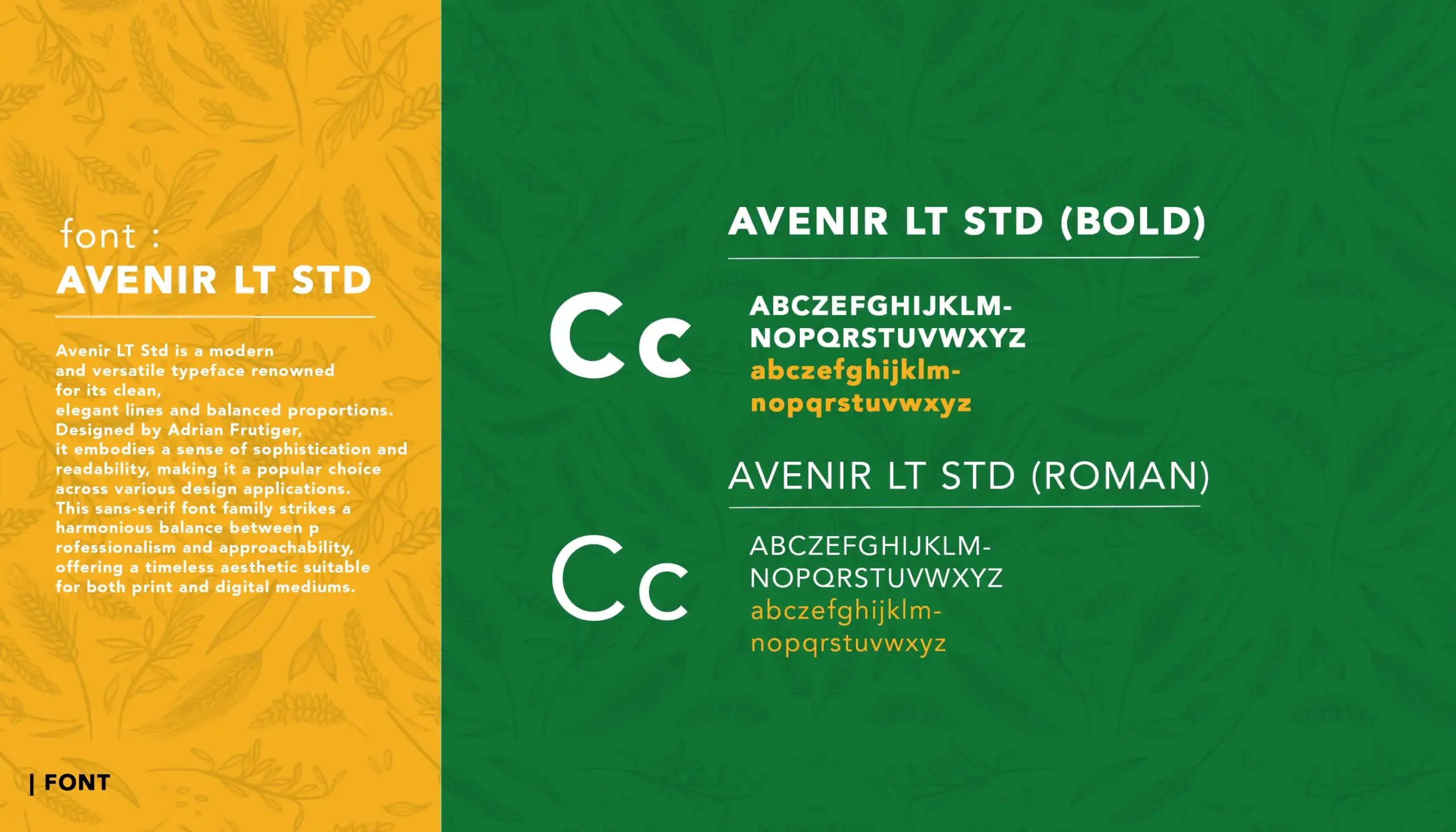
Brand Strategy, Brand Identity, Brand Style Guidelines for an agro-pharmaceutical company
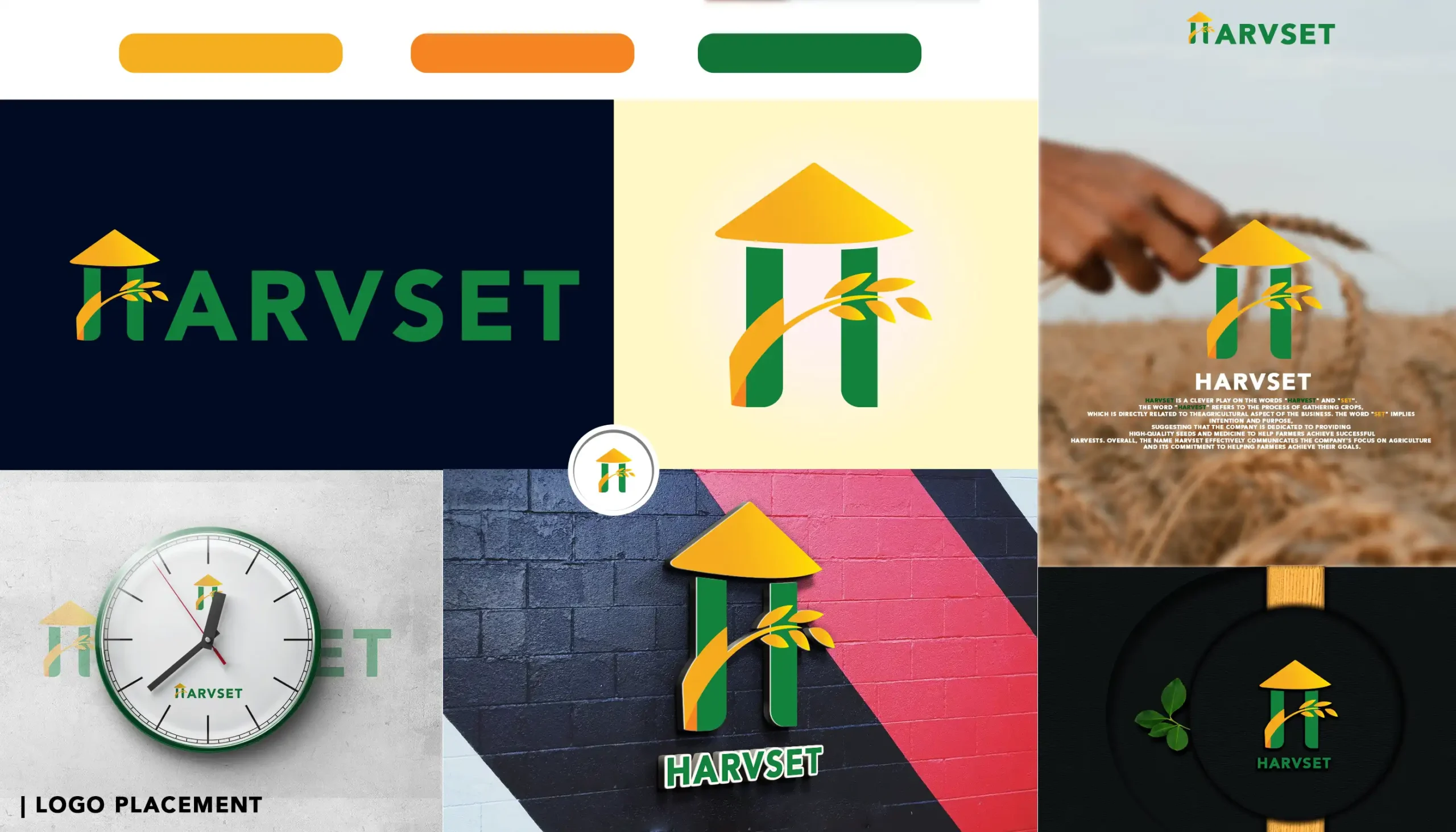
Harvset is a clever play on the words “harvest” and “set”. The word “harvest” refers to the process of gathering crops, which is directly related to theagricultural aspect of the business. The word “set” implies intention and purpose, suggesting that the company is dedicated to providing high-quality seeds and medicine to help farmers achieve successful harvests. Overall, the name Harvset effectively communicates the company’s focus on agriculture and its commitment to helping farmers achieve their goals.
The logo features a distinctive farmer hat icon,
embodying the essence of agriculture and connecting with the
agro products industry.
The hat adds a touch of authenticity and relevance to the
company’s focus on farming and cultivation.
A stylized grain of rice is artfully positioned,
emphasizing the company’s specialization in
agro products, particularly within the realm of
rice cultivation. This element adds a visual cue to the
diverse range of agricultural offerings.
The letter “H” is integrated into the farmer hat icon,
subtly representing the company name, HARVSET.