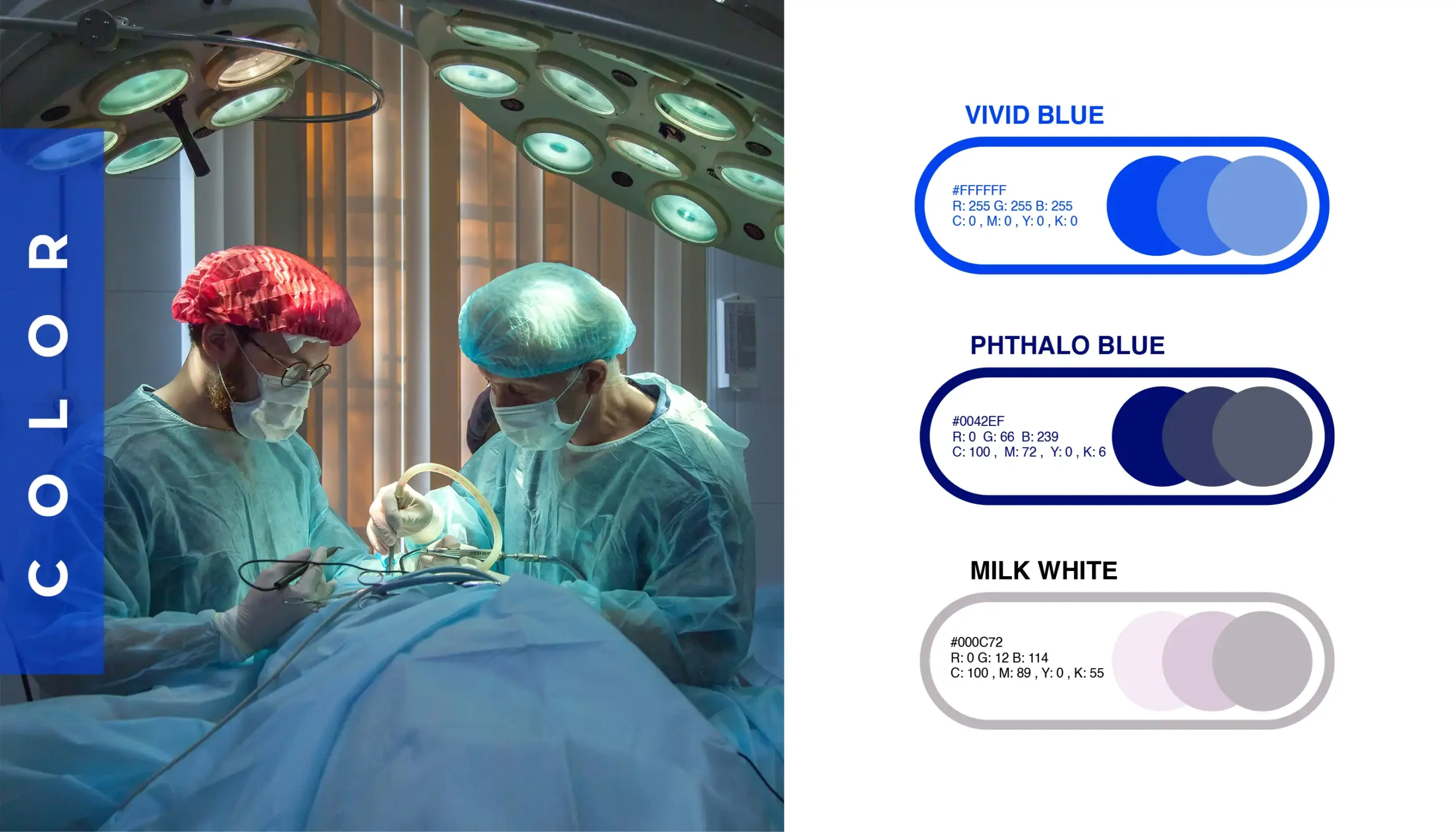


The HealFare logo features a modern and clean design, set against a vibrant blue circular background that exudes a sense of trust and professionalism. Central to the logo is a stylized stethoscope, which forms the initial “H” and seamlessly integrates a medical cross, symbolizing healthcare and wellbeing. The typography is sleek and contemporary, with the brand name “HealFare” prominently displayed in white, ensuring high contrast and readability. The overall design reflects HealFare’s commitment to providing quality healthcare services with a modern touch.


Get updates on special events and receive your first drink on us!
WhatsApp us